When people embark on a paint project, they shop around for estimates, looking for a good value. Clients can vary widely: some prioritize high-quality workmanship, others the best pricing, and many want the job to fit within their timeline.
But one factor almost everyone cares about—often deeply—is finding the “perfect” paint color.
Until they’ve chosen a color, clients might be hesitant to move forward with the job, or they may even decide to postpone it entirely.
Many painters don’t want to get involved in color selection: “Just call me when you have your colors” is a common refrain. Others spend a considerable amount of time assisting their clients or suggesting popular colors or current neutrals.
If that approach works for both parties, that’s great! But for clients losing sleep over finding their “perfect” color, there’s help available to take on this task and let contractors get back to painting.
Is there such a thing as a perfect color? Maybe, maybe not. There’s definitely such a thing as a *wrong* color. You could do a flawless paint job, but if the color feels off, that’s all the client will see. I avoid using the word “perfect” with clients, opting instead to set realistic expectations by explaining that everything affects color: the time of day, season, furnishings, finishes, lightbulbs, shadows, and highlights.
It doesn’t matter if it’s a residential or commercial job—colors need to be decided. For commercial and HOA jobs without a designer, there’s often a committee or board that must approve the colors. Similarly, residential clients often need others in their household to agree on the colors before committing.
I find that listening to all parties, being attentive to body language, communicating effectively, and staying focused on the goal are essential to achieving the best color choices.
To help you better understand what your clients are experiencing as they choose colors, I’ll share a few insights into their common stresses. I’ll also provide ways I make the process easier for clients and tips for you and your team to keep in mind when discussing colors with clients.
The Overwhelm of Options
Benjamin Moore offers over 3,500 colors, Sherwin-Williams has about 1,700, and Behr boasts over 4,000. This doesn’t even account for brands like Valspar or HGTV.
Thankfully, many of these colors can be eliminated immediately, but the sheer volume of choices can paralyze clients, leaving them unable to decide. People lose sleep and even suffer from anxiety over choosing the “right” color.
I once witnessed this firsthand while working at a paint retailer’s design center, where a client had an anxiety attack right in the store. I was taken aback—until then, I hadn’t realized how stressful color selection could be. This experience planted the seed for my passion in helping people pick paint colors.
The Confidence Gap
Another obstacle is a lack of confidence. Most people don’t regularly select paint colors, so they worry they’ll choose the wrong one. Some clients say, “I don’t know what I like,” while others say, “I know what I like, but I don’t know how to get there.” Both of these are solvable problems:
For the “I don’t know what I like” client, I encourage elimination. We start by removing colors they don’t like, which often clarifies their preferences.
For the “I know what I like” client, the struggle often lies in coordinating with their furnishings, finishes, or architecture. Trends, especially, don’t always blend with a home’s existing elements. In these cases, I suggest colors that create the ambiance they want while harmonizing with the current space.
Buyer’s Remorse
Sometimes, the quirks of lighting can lead to surprising requests. I once had a client call me in a panic days after her home was painted. She didn’t like the color in a specific corner of the room at lunchtime.
With composure, I tactfully gave her two options: she could change her seat, or we could repaint the entire space—though I reminded her she might still not love the new color in that corner. She eventually decided to change her seat.
Clear communication between you, your clients, and any color consultant is crucial. If I’m working with a contractor, I like to review the contract so I understand the job parameters. When clients request something outside the contract, I make sure they know it may require an upcharge and advise them to speak with the painter.
My role is to support the client—and, by extension, the contractor—to ensure everyone is pleased with the result. In all consultations, I remind clients that I’m a color *consultant*, not a color *dictator.* I’m here to guide them, give them the tools they need to feel confident in their decisions, and make adjustments if necessary. Ultimately, though, the final choice is always theirs.
Mary Nolte is the founder of Kaleidoscope Color Consulting and has been an interior designer since 1998. Kaleidoscope Color Consulting offers services in both residential and commercial interiors and exteriors in all sizes and styles.
Quick Tips
So, what can you do to ease clients’ color selection stress? Here are a few practical tips:
- Overwhelm Less by Limiting Choices: When handing clients a fan deck, encourage them not to focus on all the colors. Eliminating options can drastically reduce the number of choices and give them a better sense of direction. Photos for inspiration are also invaluable—pictures really are worth a thousand words.
- Build Confidence through Visuals: Clients lacking confidence may benefit from looking at images of spaces painted in the color they’re considering. I generally don’t recommend virtual painting apps from manufacturers, as these can skew a client’s perception away from a color that might actually work well in their space.
- Help Clients Understand Lighting Differences: During consultations, I often point out how lighting affects color, such as in shadows and highlights. Different walls in the same room can appear to vary in shade or tone, but the eye interprets them as one cohesive color. This insight helps clients feel more at ease with their choice, realizing that close scrutiny is usually only a concern during selection.
- Elimination and Visualization Techniques: Clients often know what they like by knowing what they don’t. Encourage them to review pictures, and listen carefully to their preferences. This helps them reach a clear direction without feeling overwhelmed.
- The Goldilocks Technique: I sometimes call this the “Goldilocks Paint Color Technique.” Once we’ve narrowed down to a color direction, I present options to get their feedback. I get a much clearer picture of what they like by asking, “Is this color too dark? Too light? Too bright? Too muted? Too warm? Too cool?” This playful approach makes the process feel lighter and helps the client zero in on what feels “just right.”
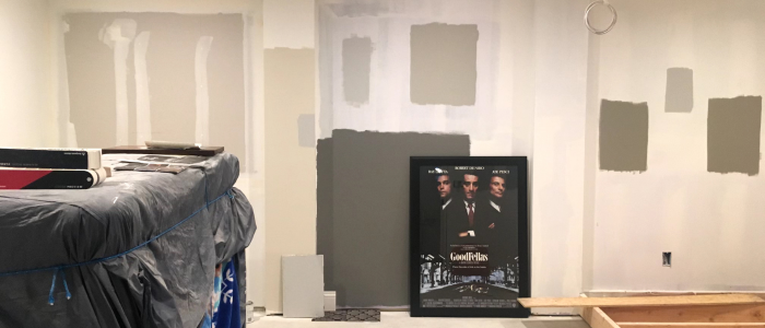
- Handling Over-Sampling and Second-Guessing: One important note: the more samples a client paints, the harder it becomes to decide. Too many options can make them second-guess every choice. In my opinion, samples are best used for clarification of a color choice rather than an exercise to create a crazy-quilt on the wall.
If you empathize with their challenges and offer helpful suggestions, your clients will appreciate your support and have the confidence to sign the contract.


