
United Colors
The secret relationship between Hue, Value, and Chroma
By Lori Sawaya
In the world of paint and design, color is more than just an aesthetic choice. When handled properly, it’s a strategic tool that can define and elevate a space.
For painting contractors and designers, understanding color as a science brings new clarity to color selection, moving past subjective opinion toward an objective, reliable process.
This article introduces a structured approach to color design for the built environment—specifically focusing on three essential dimensions of color: hue, value, and chroma. When applied effectively, these dimensions form the foundation of a consistent color workflow that saves time, reduces rework, and enhances your client’s experience.
Color Harmony
To most people, color science might seem like a purely artistic or academic pursuit. Yet for professionals, it’s a roadmap to selecting colors that not only look good, but also work well together—in other words, achieving color harmony.
Traditional approaches to color selection are often intuitive, based on personal taste or current trends.
In contrast, a science-based strategy provides consistency and predictability, grounded in the physical properties of color.
Let’s start by defining the three dimensions:
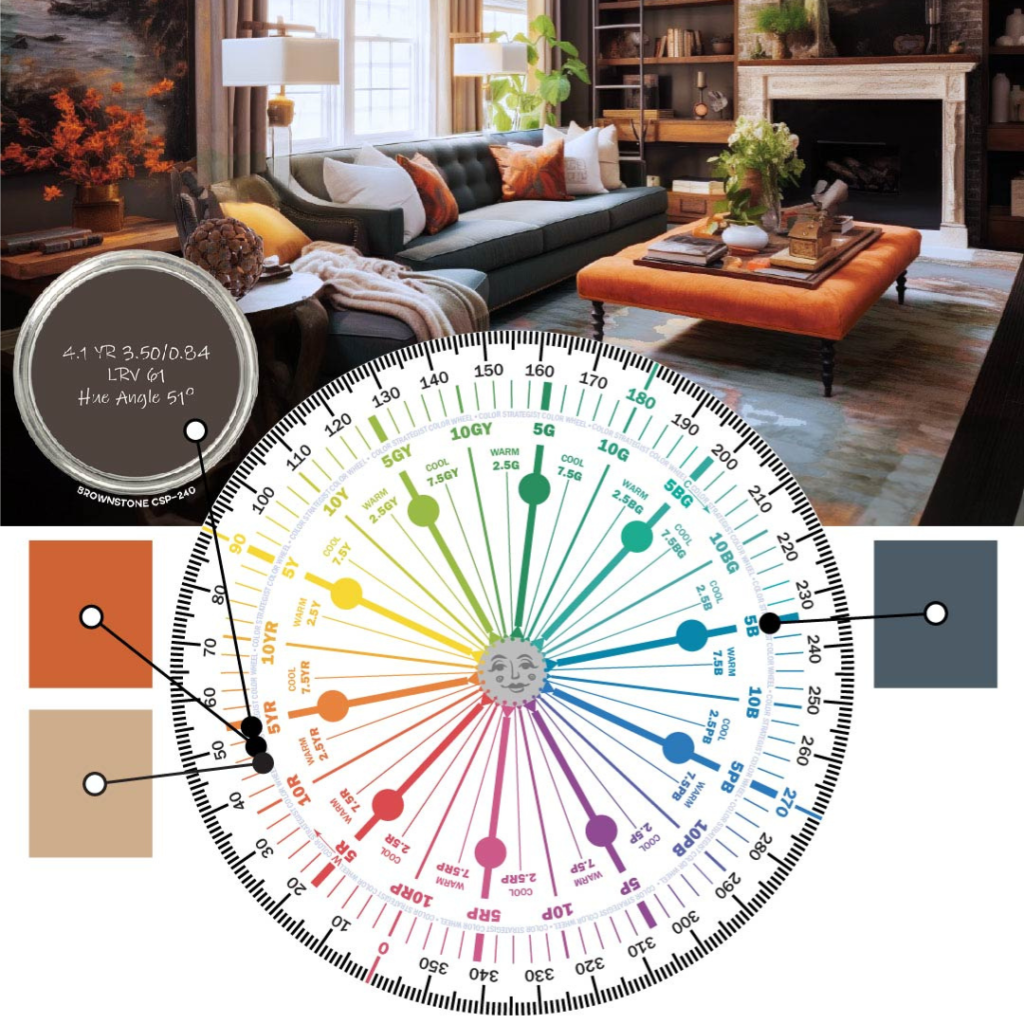
- Hue: A color’s hue is determined by its dominant wavelength, which places it in categories like red, yellow, or blue.
- Value: How light or dark a color appears, from Sky Blue to Dark Navy.
- Chroma: The intensity of a color, ranging from vivid, high-impact hues to muted, neutral tones.
This structured approach takes the guesswork out of color selection, allowing you to create balanced palettes that enhance any space. By working with hue, value, and chroma—the same three dimensions our eyes use to process color—you can make color choices that are both visually satisfying and practically effective.
Defining “Hue”
Here’s a key piece of color know-how: hue and color aren’t the same thing! Hue has only one dimension, while color has three, with hue being one of those three.
Hue refers to a color’s dominant wavelength, something we can measure objectively, which sets it apart from the subjective idea of “undertones.”
A hue notation is repeatable and based on data, allowing professionals to classify color accurately. In color systems, hues are organized into ten distinct families–Red-Purple, Red, Yellow-Red, Yellow, Green-Yellow, Green, Blue-Green, Blue, Purple-Blue, and Purple–providing a clear structure for creating and understanding color relationships.
Why does this matter for your workflow?
Organizing colors by hue families makes it easy to identify and describe color appearance and map out color relationships. For example, grouping swatches by hue helps you guide clients through cohesive options, whether they’re drawn to analogous palettes (neighboring hues) or want complementary color contrasts (opposing hues in color space).
This approach also helps streamline decisions on-site or in-store, saving time and ensuring that color choices align across the project’s goals.
Uncovering “Value”
Value, the second dimension, refers to how light or dark a color looks. Imagine a black-and-white photo of a room; the gradations of light and dark represent value. In the world of color, value helps determine how a color will interact with light and shadow in a space.
Higher-value colors are lighter (think pastels), while lower-value colors are darker (like navy or charcoal). Understanding value is essential for creating contrast and balance.
For instance, pairing colors of similar hues but contrasting values (like a soft lavender wall with a deep eggplant accent) can create visual interest without straying from a unified palette.
Value is also crucial in managing light levels in a room—lighter values create a more open, airy feel, while darker values add depth and coziness.
Value lets you troubleshoot common design challenges. For example, pairing a light, high-value wall color with darker trim adds depth and highlights detailed millwork.
Highs and Lows
Chroma, the third dimension, refers to the intensity of a color: essentially, how strong, or vivid a color appears. High-chroma colors are intense and bold, while low-chroma colors are muted and subtle.
Chroma is particularly useful when working to achieve a specific look or feel within a design.
For example, imagine a client project involving a vibrant, social living area versus a tranquil bedroom retreat. In the living area, high-chroma colors in decorative elements, like throw pillows or wall art, can energize the space without overwhelming it. Conversely, in the bedroom, using low-chroma, muted shades on the walls and furniture can promote relaxation and comfort.
By tuning chroma to the purpose of each room, you can meet functional goals while also achieving harmony in design.
Adjusting chroma also helps solve practical design issues. For spaces meant to be calming or elegant, choosing lower chroma colors helps create a sophisticated look, while bold, high-chroma colors are more appropriate in areas where energy and interaction are encouraged.
For instance, swapping high-chroma paints for lower-chroma tones on large surfaces can calm a space, while introducing a few high-chroma accents can invigorate a room that feels flat.
Scientific Design
The reason for using hue, value, and chroma is straightforward: our eyes naturally process color using these dimensions. This systematic approach eliminates guesswork and subjective interpretation, providing clarity and consistency in your color selections.
An evidence-based color design workflow is also more efficient. You can quickly narrow down choices by filtering out colors that don’t fit the client brief, saving time and simplifying your decision-making process.
Whether you’re choosing a full palette for a home or selecting a single accent color, this ordered method ensures that every choice contributes to a cohesive, aesthetically pleasing design.
Looking Ahead
As a paint contractor or designer, embracing a science-based approach to color enhances your credibility and efficiency. Understanding hue, value, and chroma allows you to navigate the complexities of color selection with confidence, producing results that resonate with clients and stand the test of time. You can take pride in offering clients a solution backed by science rather than guesswork.
This foundational knowledge also sets you up for the next level of color strategy: intentionally selecting and applying colors to achieve cohesive, well-balanced designs. By mastering these three dimensions of color, you’re taking the first step toward a more refined, efficient, and stress-free approach to color design.
In the next article in this series, I’ll share more insights and techniques, giving you the tools to try a hue, value, and chroma framework and see how it can transform your workflow and results.
Lori Sawaya trains and certifies Color Strategists, equipping them with expert techniques to apply color science in specifying paint colors, through her platforms at Camp Chroma and The Land of Color.
PULLQUOTES:
The reason for using hue, value, and chroma is straightforward: our eyes naturally process color using these dimensions.
Understanding hue, value, and chroma allows you to navigate the complexities of color selection with confidence, producing results that resonate with clients and stand the test of time.


